Creating a Mobile-Friendly Newsletter: Essential Tips and Strategies
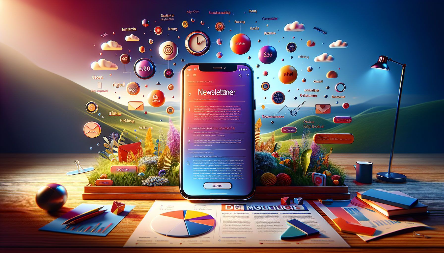
Creating a Mobile-Friendly Newsletter from Day One
Understanding the Importance of Mobile-Friendly Newsletters
In today's digital landscape, having a mobile-friendly newsletter is not just an option—it's a necessity. Over 55% of all email opens occur on mobile devices, according to Litmus. This means that if your newsletter isn't optimized for mobile, you could be missing out on a significant portion of your audience.
With the sheer volume of emails being sent daily—over 300 billion —capturing attention on a small screen requires a thoughtful approach. A mobile-friendly design ensures that your message is accessible, engaging, and visually appealing, leading to better performance metrics like higher open and click-through rates.
Pro tip: Test your newsletters on multiple devices and screen sizes to ensure a consistent experience across all platforms.
Key Elements of a Mobile-Friendly Newsletter
To create an effective mobile-friendly newsletter, keep these critical elements in mind:
Responsive Design
Responsive design is a web development approach that allows your newsletters to adapt seamlessly to different screen sizes. By using fluid grids and flexible images, your content will maintain its integrity across devices. This prevents the need for horizontal scrolling, ensuring that readers can easily navigate your newsletter.
Concise Subject Lines
Mobile users are often on the go and prefer quick information processing. Craft subject lines that are concise and to the point. Aim for fewer than 50 characters to ensure the full message displays on mobile. Personalized subject lines can also improve open rates, making your email stand out in a crowded inbox.
Pro tip: Use A/B testing for subject lines to discover what resonates best with your audience, enhancing open rates further.
Clear Call to Action (CTA)
Mobile devices have limited screen space, so your CTA must be straightforward and easily clickable. Use large buttons, contrasting colors, and direct action phrases like “Shop Now” or “Subscribe Today.” Position your CTA near the top to catch the reader's attention quickly, especially considering that mobile users scroll differently than desktop users.
Pro tip: Track CTA performance using analytics tools to understand what works best for your audience's behavior.
Crafting Content for Mobile Audiences
The way you present content in your newsletter can significantly impact its effectiveness.
Short Paragraphs and Bullet Points
Mobile readers prefer quick read content. Break longer paragraphs into bite-sized segments, ideally keeping them under three sentences . Utilize bullet points or numbered lists to convey essential information quickly. This format can increase the readability and engagement of your newsletter.
Visuals and Multimedia Elements
Images, GIFs, and videos can enhance engagement, but they must be optimized for mobile. Use images with a width of 600 px or less to ensure they fit within the mobile frame. Additionally, alt text will help convey your message even if images do not load, providing accessibility for all users.
Pro tip: Use tools like Canva for easy image creation and resizing to ensure your visuals look great on mobile devices.
Integrating Coupons and Promotions
For retailers, mobile newsletters are an excellent opportunity to drive sales through timely promotions. An effective newsletter integrates valuable coupons or offers that can be redeemed immediately.
Mobile-Optimized Coupon Designs
Ensure your coupon designs are easy to read and visually appealing. Use clear fonts and adequate spacing to allow quick comprehension. Place the coupon near the top of the newsletter to grab attention right away.
One-Click Redemption Feature
Consider integrating a feature that allows users to redeem coupons with just one click. This eliminates barriers to purchase and increases conversion rates. Include a clear link to your webshop or online store within the coupon section for added convenience.
Pro tip: Track redemption rates by creating unique coupon codes for each newsletter campaign to measure effectiveness accurately.
Choosing the Right Email Marketing Platform
Your choice of email marketing platform can greatly influence how your mobile newsletter is delivered and interacted with.
Platforms with Mobile-Friendly Templates
Select an email marketing platform that offers responsive templates . Services like Mailchimp, Constant Contact, or Sendinblue provide mobile-friendly options. These templates come pre-designed with best practices in mind, allowing you to easily customize them to suit your branding.
Analytics and Reporting Tools
Choose a platform that offers comprehensive analytics to track user engagement, open rates, and click-through rates. Data-driven insights will help you refine your strategy over time. Understanding how your audience interacts with your newsletters plays a crucial role in improving your campaigns.
Pro tip: Leverage A/B testing features available in your email marketing platform to continuously optimize your newsletters based on real-time feedback.
Testing and Optimizing Your Newsletters
Creating a mobile-friendly newsletter is an ongoing process. Continuous testing and optimization are key to staying relevant and engaging.
Conduct Regular Usability Tests
Regularly conduct usability tests with real users to gather feedback on how your audience navigates your newsletters. Use this information to identify any pain points or areas for enhancement. Consider leveraging tools like UsabilityHub for user testing.
Monitor Performance Metrics
Keep a close eye on performance metrics such as open rates, click-through rates, and bounce rates. This data will help you determine which elements resonate with your audience and which need adjustment. Experimentation can lead to significant improvements in future campaigns.
Pro tip: Set aside time each month to review performance metrics and adjust your strategy accordingly for optimal results.
Conclusion
Creating a mobile-friendly newsletter from day one is critical for effectively reaching your audience in a world where mobile usage is continuously on the rise. By focusing on responsive design, concise content, clear CTAs, and regular optimization, you can ensure that your newsletters are not just great to look at but also drive engagement and conversions.
Remember, it’s all about simplicity, clarity, and accessibility. Implementing these strategies will not only enhance user experience but also ensure that you stand out in a crowded inbox. So go ahead, start designing that mobile-friendly newsletter today!
Looking for the best system for sending newsletters?