The Role of Visuals in Your First Newsletter
The Role of Visuals in Your First Newsletter
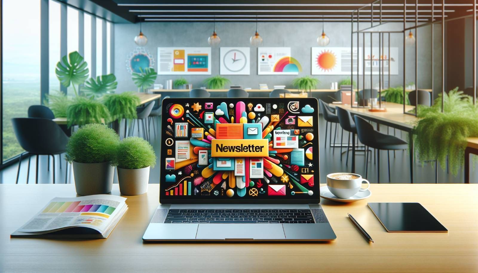
Understanding the Importance of Visuals
When crafting your first newsletter, it's crucial to grasp why visuals matter. Visuals can enhance engagement, improve readability, and significantly increase the chances of conversions. Studies show that people process visuals 60,000 times faster than text, which means if you're not utilizing compelling imagery, you're missing out on valuable engagement.
Furthermore, newsletters with visuals have a 42% higher open rate, which is essential in a world flooded with competing messages. Your goal is to stand out, and effective visuals can help you do just that.
Pro tip: Always consider your audience when selecting visuals. Use images that resonate with their interests and preferences to establish a connection.
Types of Visuals to Include
When it comes to visuals, there are various types you can incorporate into your newsletter. Here are some effective options:
Images
High-quality images are vital for grabbing attention. Whether you use product images, team photos, or lifestyle images, ensure they are tailored to your brand's identity and convey your message effectively. According to HubSpot, using images can boost engagement rates by 94%.
Pro tip: Use images that tell a story about your brand or products. Customers are more likely to connect with a narrative than with mere product listings.
Infographics
Infographics can simplify complex information and make it digestible. They offer a great way to present statistics, share tips, or showcase processes in an engaging manner.
In fact, infographics are shared three times more often than other types of content, making them a brilliant choice for increasing shareability.
Pro tip: To create impactful infographics, use a blend of well-researched data and visually appealing design elements, ensuring clarity without overcrowding.
Videos
Videos can elevate your newsletter's content. A carefully crafted video can increase click-through rates significantly, often by as much as 200-300%. They can be product demos, tutorials, or customer testimonials.
With video content continuing to dominate the digital landscape, incorporating it into your newsletter can make your message more memorable.
Pro tip: Keep your videos short—aim for 1-2 minutes—to maintain viewer engagement. Also, always include a clear call to action.
Icons and Graphics
Icons and graphics can guide your readers through the newsletter. They provide visual breaks that can help with readability. Choosing icons that align with your brand can also strengthen brand recognition.
Pro tip: Ensure that your icons are uniform in style to create a cohesive look throughout your newsletter.
Designing Your Visuals
Once you’ve decided on the types of visuals, it’s time to focus on designing them effectively. A well-designed visual will grab attention and encourage further exploration.
Color Theory
Utilizing the right color palette is essential as it evokes emotions and can influence purchasing decisions. For example, blue conveys trust, while orange signals urgency. Research shows that colors can increase brand recognition by up to 80%.
Pro tip: Stick to a consistent color scheme that reflects your brand's identity. You can use tools like Adobe Color to create harmonious palettes.
Typography
The choice of typography is equally important. Opt for fonts that are easy to read at various sizes, especially since many users check emails on mobile devices. Using different font weights can also help emphasize certain messages.
Pro tip: Limit your newsletter to two or three font families to maintain a clean and professional appearance.
White Space
Never underestimate the power of white space in your newsletter design. It can significantly improve readability by allowing your content to breathe. Cluttered newsletters can overwhelm your audience, leading to higher unsubscribe rates.
Pro tip: Aim for a balanced layout with adequate white space, ensuring each section is distinct yet unified as a whole.
Testing Visuals for Impact
Testing is crucial for gauging the success of your visuals. What works for one audience might not resonate with another, so A/B testing different versions of your newsletter is key.
Metrics to Consider
You should track metrics such as open rates, click-through rates, and conversion rates to measure the performance of the visuals you use. Tools like Google Analytics can help you scrutinize which visuals engage your audience more effectively.
Pro tip: Pay close attention to user feedback and adjust your visuals based on what your audience responds to the most.
Iterate and Improve
After gathering data, make necessary adjustments to your visuals. A newsletter should be a living document that evolves based on your audience’s preferences. This process will not only keep your audience engaged but also garner trust.
Pro tip: Conduct surveys or polls periodically to get direct insights into what your audience likes or dislikes about your visuals.
Integrating Call to Action with Visuals
Every newsletter should encourage the reader to take action, and visuals can play a critical role in this.
Positioning Your CTA
Your Call to Action (CTA) should be visually distinctive. Use contrasting colors or larger text to make it pop. This will ensure that even skimmers can easily spot it.
Pro tip: Use action-oriented language in your CTA to evoke urgency and emotion, such as “Shop Now” or “Discover More.”
Linking Visuals to Actions
Not only should your CTA stand out, but it should also be integrated with your visuals. If using a product image, make it clickable directly to the product page. This seamless connection can significantly enhance the user experience.
Pro tip: Always test your CTAs to ensure they lead to the correct pages and that the links function properly.
Maintaining Brand Consistency
Ensuring brand consistency across your newsletter is essential for building trust with your audience. Your visual elements—including logos, colors, and fonts—should be recognizable and in line with your overall branding strategy.
Consistent Messaging
Consistent messaging reinforces brand identity. Ensure that your visuals echo your newsletter's voice and the story you're telling. For retailers and webshop owners, this includes aligning promotional visuals with your current campaigns.
Pro tip: Have a style guide in place that includes specifications for colors, fonts, and logo use. This will serve as a reference point and maintain consistency across all communications.
Update as Needed
Branding is not stagnant. As your brand evolves, ensure your visuals are updated accordingly. Staying relevant in your visual representation showcases that your brand is current and engaged.
Pro tip: Periodically review your visual assets to ensure they align with any recent branding changes or market trends.
Final Thoughts
Creating a compelling newsletter is an art, and visuals play a crucial role in that artwork. By understanding the importance of visuals, selecting the right types, designing them effectively, and maintaining consistency, you can significantly enhance your newsletters' effectiveness.
Remember, at the end of the day, your goal is to connect and engage with your audience. So take the time to craft visuals that not only represent your brand but also resonate with your readers.
Pro tip: Continue learning and adapting your strategies based on audience feedback and engagement metrics to ensure the ongoing success of your newsletters.
Looking for the best system for sending newsletters?